How Mac and Windows Inspired a Better Bookmark Manager
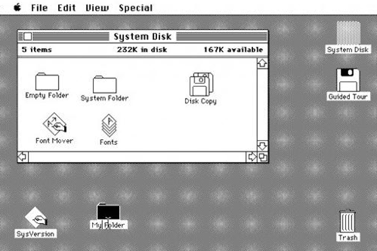
The image above captures a piece of computer history. It is a screenshot of the Apple Lisa from 1984, the first commercial computer to have a Graphical User Interface (GUI). The computer that Steve Jobs poured his heart and soul into enough to name after his daughter, Lisa. Of note is that this GUI looks more or less the same as Mac OS looks now. The icons are a similar size, there’s similar spacing, the folders look similar, there is drag and drop, etc. This GUI, while significantly expanded, has been the underlying user interface (UI) for organizing the majority of the world’s computer files for over 30 years.
Given this robust test, it is fair to say, this UI is an amazing way to manage files on a computer. Additionally, bookmarks are very similar to files. In many ways they are analogous to apps: you click to open them, they perform a function, and both benefit from good organization. Thus, it makes sense to inspect Mac and Windows for inspiration on ways to manage our bookmarks.
Mac and Windows Commonalities
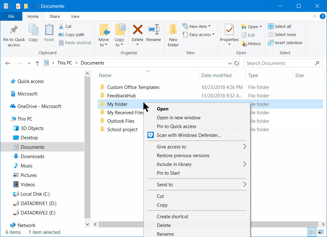
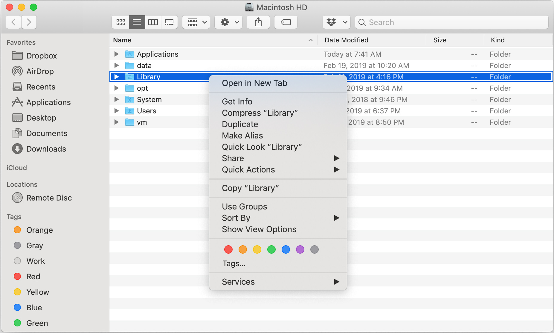
In these two screenshots from the newest versions of Windows and Mac, we can see many similarities. Both have the same general layout: a main section with folders and files, a sidebar on the left which you can drag items into, and a navigation bar on top with functions for interacting with items. In the main section, folders and files are presented similarly. They both utilize a list to show info about items such as Date Modified, Size, and Type and allow the user to sort by these details. Everything is also a similar size such as the icons themselves, icon names, and items in the left sidebar.
Other similarities include back and forward arrows in the top left for easy navigation, a search bar in the top right, the ability to drag-select items, and context menus. Context menus are powerful UI elements that provide functionality depending on the context. For example, a different menu will show if you click on a file, a folder, or if you click on multiple highlighted items.
Another commonality, not illustrated in these examples, is the desktop. Starting with the Apple Lisa to whatever operating system you are using now, all iterations have a default “start screen” that contains icons organized in a gridded fashion. The desktop is a way to keep the chaos of your files at bay. It is often an ephemeral workspace, a place where active files go until you no longer need them. Interestingly, you can’t view the desktop in list mode on Mac (you can in Windows with some tweaking), only this “gridded” icon mode. This is a feature and not a bug; a restriction implemented to corral the user to keep the topmost level organized. With list mode, you could end up with an endless list of items whereas in icon mode you are limited by space. In summary, the desktop is a feature that helps you keep your files organized over time.
One more powerful shared feature is customization. If you dig into the settings, you can change the icon size, font size, add columns (such as “Created at” and “Notes”), reorder these columns, and more. For example, if you have a folder of photos and can’t remember which one you opened last, you can add a “Last opened” column and sort by it. These common UI elements form a core GUI present in many other operating systems as well. If you look at the Ubuntu GUI, one of the most popular Linux distributions, it will look very similar.
Defining a Bookmark Manager
Let’s dive into the basic requirements of a bookmark manager and how they can benefit from this common core GUI. An effective bookmark manager should allow the user to do 4 things:
- Save a URL.
- Find a URL.
- Facilitate organizing saved URLs.
- Facilitate browsing saved URLs.
Saving a URL is the simplest and most top-level requirement. An application cannot call itself a bookmark manager without the ability to save. Facilitating the finding of a bookmark is next. A bookmark manager should make it easy for a user to find a saved bookmark. These two features are the bare-bones requirements.
By this definition, a text document is technically a bookmark manager. You can paste links into it and find them later with search. The issue with this option is that the difficulty of finding a bookmark varies directly with the number of links. It becomes cumbersome to find a URL with just search once you have hundreds or thousands of URLs. What if you can’t remember a name or there are duplicate names? You need a way to organize them and easily keep them organized over time, which is the third requirement. Generally, organizing bookmarks involves folders and/or tags.
Lastly, a bookmark manager should make it easy to browse your bookmarks. Browsing is essentially “re-discovering.” A common use-case is to bookmark something that seems interesting but you’re not sure if you will use it in the future. By facilitating browsing, a bookmark manager can help a user re-discover content that they have already curated.
Browser Bookmark Managers
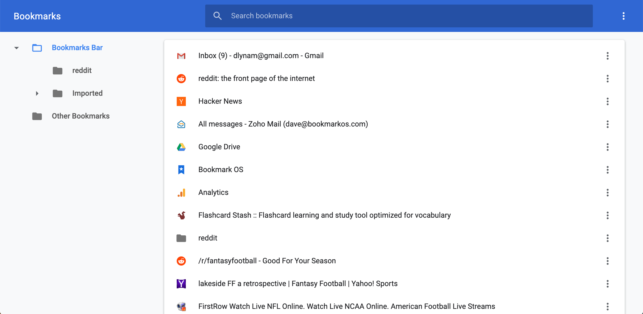
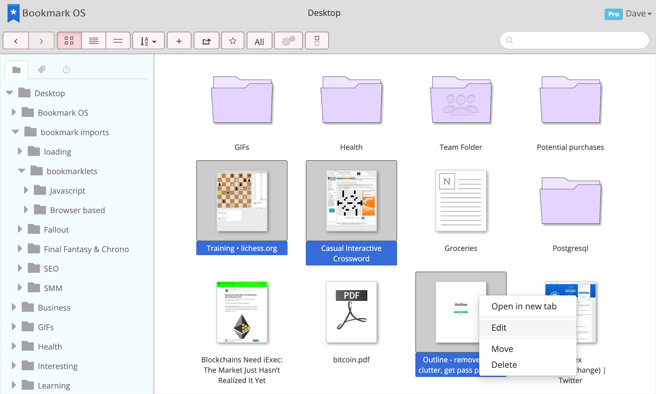
Here we see Chrome’s built-in bookmark manager which contains some of the common core UI elements from Mac and Windows. The layout is similar, there is drag and drop (but no drag-select), and context menus. It meets the requirements of a bookmark manager well enough but lacks many relevant features from Mac and Windows. Specifically, there is no feature-rich navigation bar for interacting with the main section of bookmarks, there is just search. You can’t see any other bookmark details such as “Created at,” “Last opened at,” or “Domain” and can’t sort by these details either. There is also no way to view all your bookmarks in one list and sort. Additionally, you cannot sort search results or add notes to your bookmarks.
Another key feature of the core GUI components that is missing is customization. You can’t change the icon sizes, change font sizes, add columns, etc. You also can’t enable a “gridded” icon mode and are restricted to list mode. No icon mode means no desktop paradigm, which is perhaps the biggest reason why the Chrome bookmark manager often ends up in a disordered mess.
An additional bookmarking scenario, that may contribute to clutter, is to bookmark something because it is time-sensitive. Similar to using the desktop as a workspace for current files. You may bookmark something knowing that you want to be reminded of it and come back to it soon. You don’t want to put it deep into a folder, so you add it to your toolbar. In time, this toolbar fills up with these unanchored bookmarks, eventually becoming the endless list that a desktop feature prevents. The Chrome bookmark manager also lacks tags which are present in both Mac and Windows. Tags can be very helpful when organizing a large number of items that have some similarities and bookmarks are a great use case.
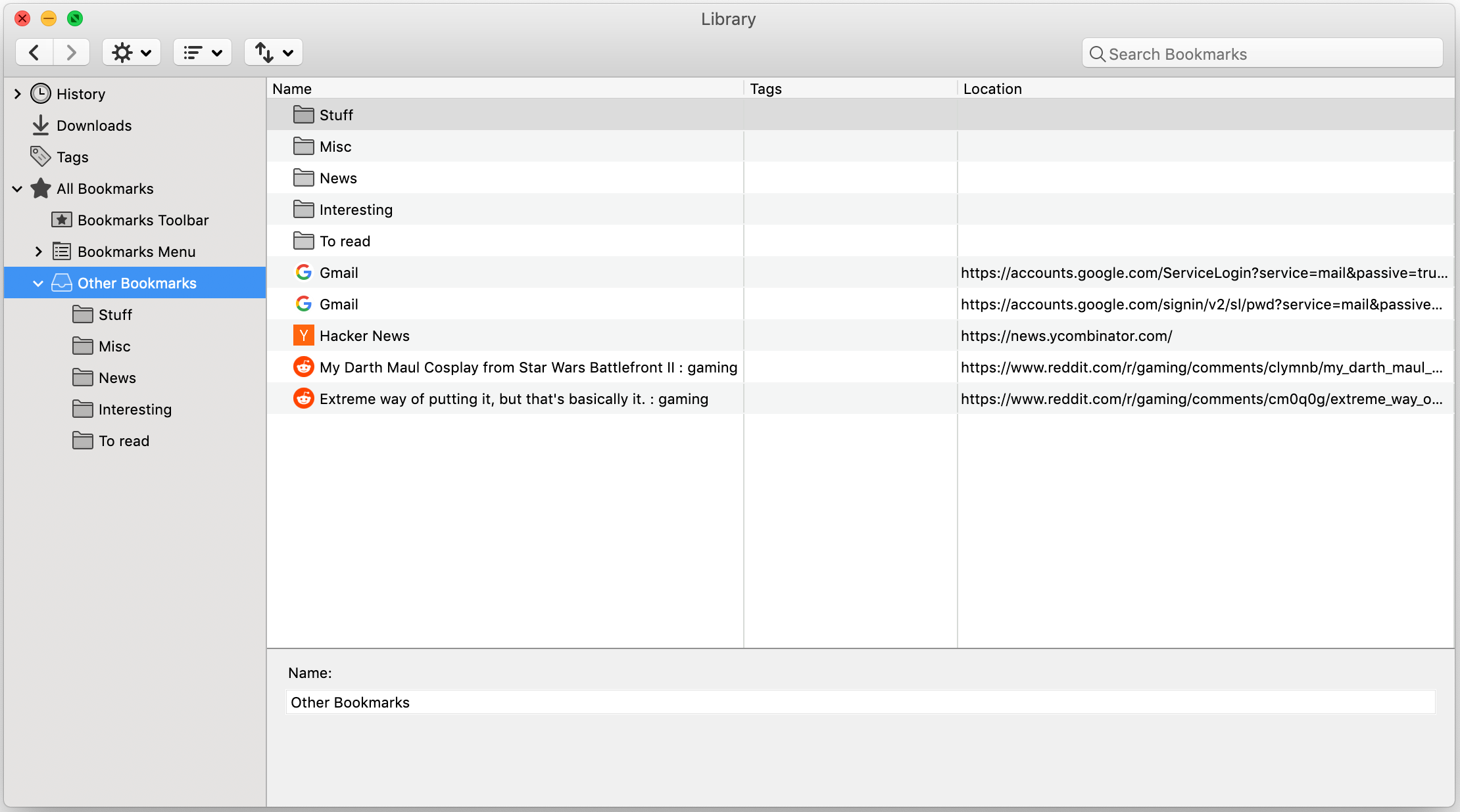
The built-in Firefox bookmark manager has more features. It can sort, add, show, and reorder columns; a capability missing in Chrome. It also has tags and bookmark notes. Though similar to Chrome you can’t customize the icon and font size, there’s no drag-select, and you can’t see the folder path for bookmarks in search results. The biggest downside is that there is no icon mode and as a result, no desktop. You are confined to lists, which can become disorderly.
Though Firefox’s bookmark manager is much closer to Mac or Windows than Chrome’s bookmark manager, it still lacks some valuable features that could aid organization. Comparatively, finding bookmarks over time is harder than finding files on your computer. Neither browser makes it easy to browse your bookmarks as well. You are confined to list mode with small favicons and text. Whereas in a GUI, you can enable icon mode, make the icons a bit bigger, and browse them with ease.
Web-based Bookmark Managers
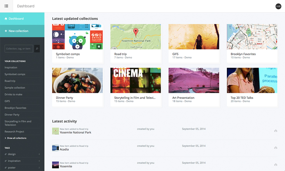
There are countless great web-based bookmark managers out there but in general, they mainly follow one of two UI paradigms: visual-based or list-based. Dropmark (pictured above) is an example of a visual-based bookmark manager. In terms of the common core UI elements, you can sort, use tags, and there is a desktop-like interface. Also, screenshots of web pages are used for bookmarks, making them feel like large icons. This is a great feature that facilitates easier browsing of your bookmarks. Other than that, this website doesn’t feel like a single-page app and hence doesn’t feel like Mac or Windows. It lacks drag and drop, context menus, customization, list mode, and more.
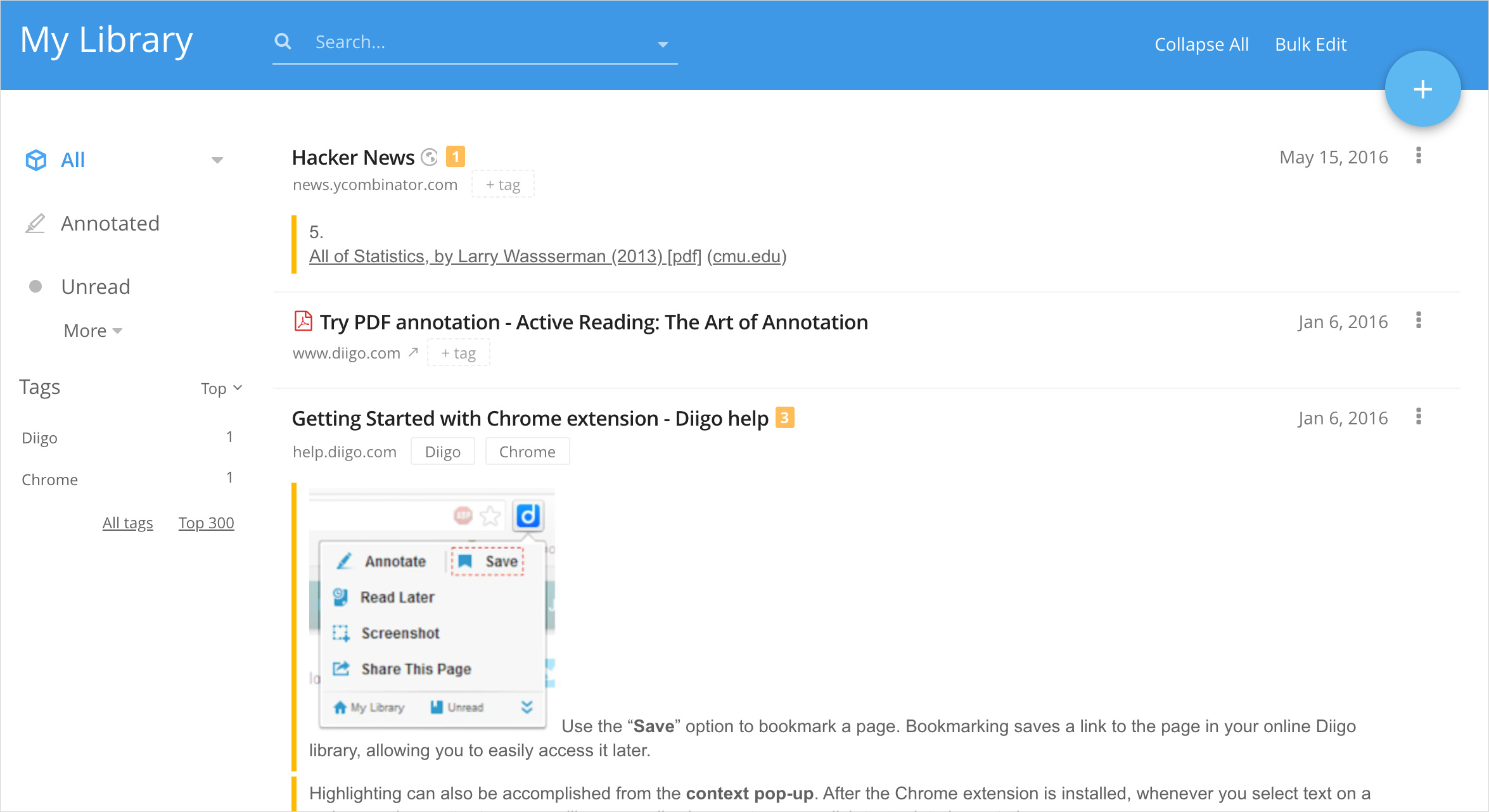
Diigo (pictured above) is an example of a list-based bookmark manager. Diigo has some great bookmark specific features such as annotations, tags, caching web pages, and sharing, but in terms of the common core UI, it is not very similar. You can’t sort, change to icon mode, drag and drop, or customize sizing. There also isn’t a desktop feature and the website is not a single-page app.
Web-based apps are attractive because they offer great bookmarking innovations such as annotations, caching, and screenshots. However, nothing offers an experience that leverages all the core UI features of Mac and Windows to facilitate easier organization. Sub-optimal organization eventually leads to sub-optimal finding. As a result, extracting value from these innovative features becomes bottlenecked. Users would better served if bookmark managers were to adopt more of the core UI elements.
Breaking paradigms
Not only can bookmark managers benefit from the core UI elements, but any web app that involves item organization can benefit. As a general takeaway, it is a good idea to look outside of the ecosystem that your product exists within for UI inspiration. There are many examples of successful products that have done so. For example:
- Google Docs looking outside of websites and drawing inspiration from Microsoft Word for a browser-based word processor.
- Amazon’s Kindle looking outside of the e-reader/tablet paradigm and taking inspiration from books to implement non-glare E ink technology.
- Mobile games drawing inspiration from 80s/90s arcade games.
It is important to be mindful of the eco-system that your product exists within and which paradigms you are looking at for insights. There may be better paradigms to draw inspiration from.
An Aha Moment
Bookmark clutter had always been an issue for me. I went through periods where I stopped using them altogether because I wasn’t able to get enough value out of them. At one point I started dragging URLs into folders on my desktop. This was an aha moment. I was able to leverage the UI of my operating system to keep my bookmarks organized and it worked very well.
Being a web developer and UI designer, I figured I could build a better version for the web. I dove in, and for the past 4 years, I have been working towards this goal as a side project. The result is a browser-based bookmark manager that emulates the core Mac and Windows UI with bookmark specific functionality on top. Features such as AI-powered folder recommendations, time filters, and screenshot icons make managing and browsing your bookmarks even easier. I get unsolicited feedback all the time from users who literally say that they love the product, which feels great! It is called Bookmark OS and is pictured below.