Why Google's bookmark manager and Docs have purposefully bad UI

Chrome’s bookmark manager and Google docs have questionably bad UI and design. They both lack such basic organizational features, such as tags, one has to wonder if they are purposefully bad at helping you stay organized.
Chrome made an attempt at a revamped bookmark manager in 2014 but ended up shutting it down in 2018 due to criticism. There was a design update to match the material aesthetic of the browser itself in 2017 but no real material updates to the UI and design. As for features, there are still no tags, you can only sort by name, there are no folder icons, no folder colors, etc.
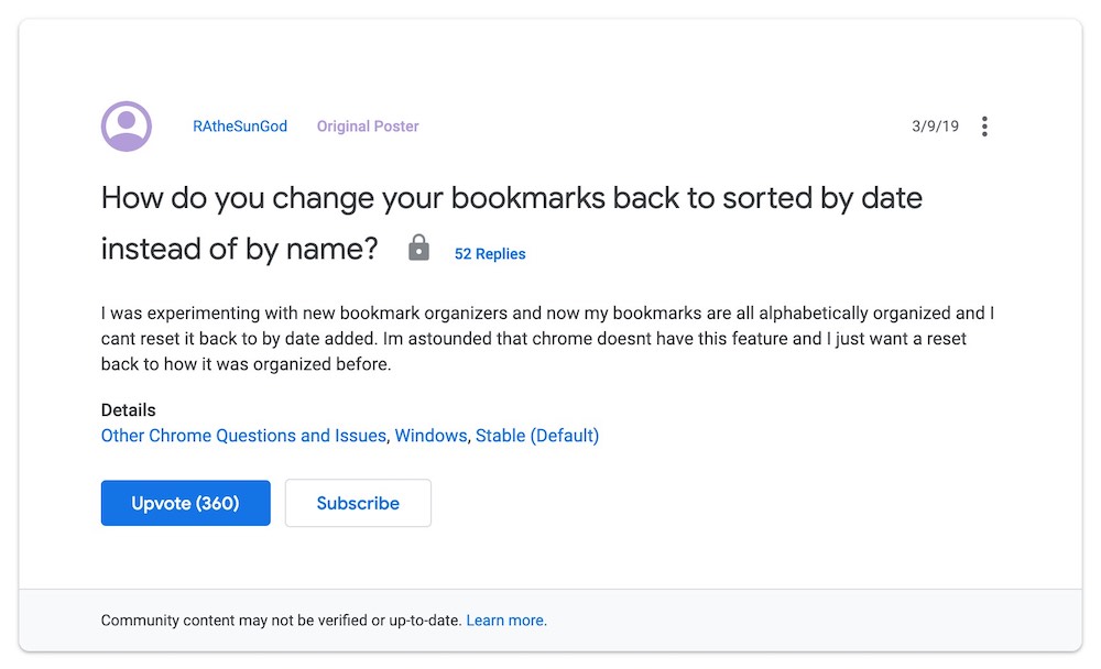
The fact that you can only sort your bookmarks by name says a lot in and of itself. You can find many, “astounded” users, such as in this Chrome support thread, that simply want to sort their bookmarks by date without having to install an extension.

Google Drive is a similar story. It doesn’t have tags, folder icons, folder colors, you can’t change item sizes, and there are limited sorting options. Minimal features serve a purpose. When things are disorganized enough that you can’t browse folders for them, the only other way to find something is to search. And as you can see in the following screenshots, “search” is top and center in both products.


Google’s core business is still “search.” By neglecting UI and design for these products, Google corals user behavior into a “search-first” mentality. The more disorganized you become, the more reliant you become on search, and Google benefits.
I’ve often heard people say they no longer use bookmarks and just rely on search. I wonder if that truly is the most practical solution for them or if it is the result of a self-serving dark pattern from Google.